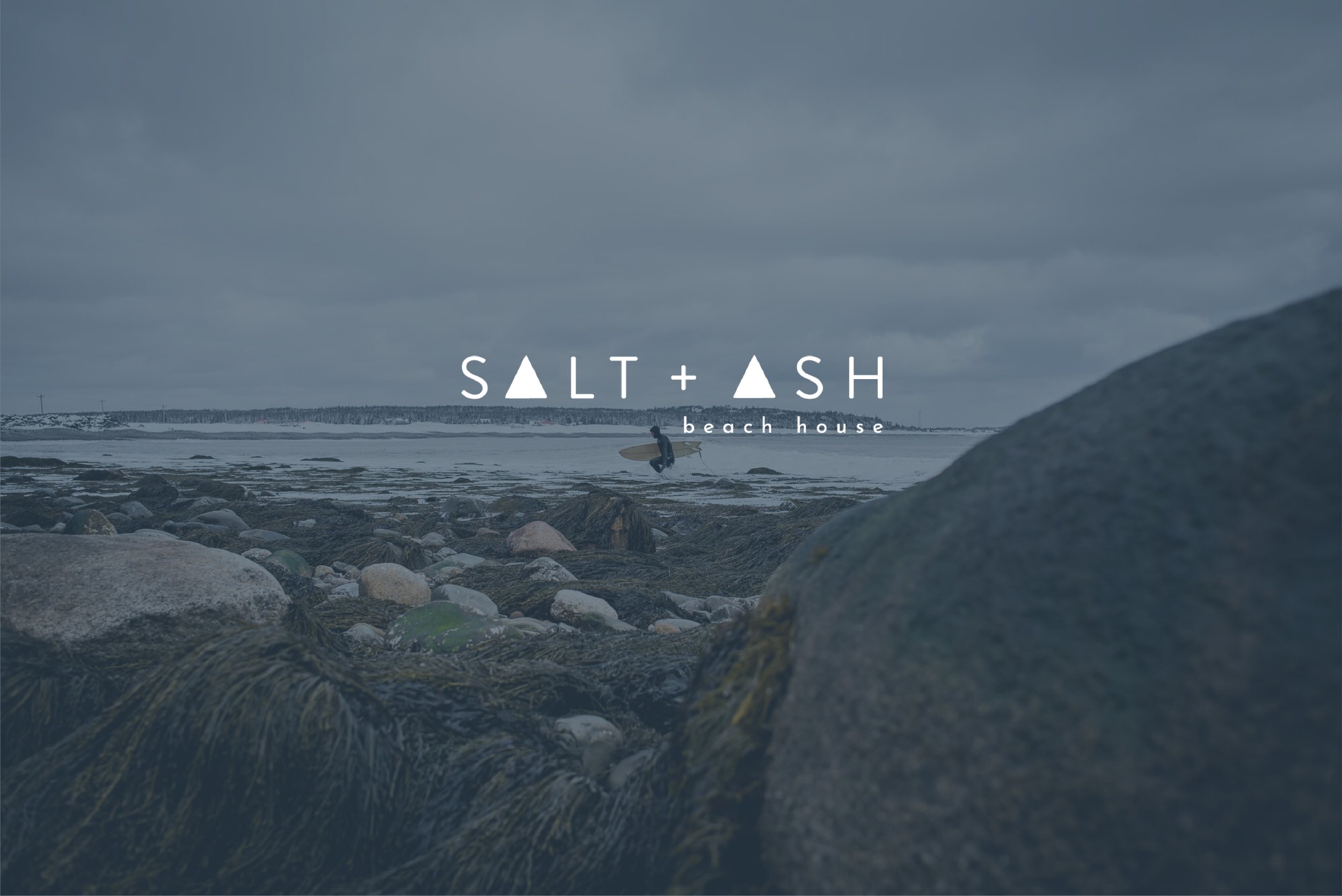
Salt + Ash Beach House, Halifax N.S.
Creative direction,
web design,
and design development for an approachable, live-fire restaurant in the
heart of Halifax.

The triangular shapes in the logo represent
pillars of salt + ash. Being a family-oriented, approachable restaurant, Salt+Ash needed a
logo that felt rooted in strength + togetherness, which are pillars of any great family.


